Streaming has evolved from background noise to a full sensory routine woven into daily life. People expect smooth motion, clear text, and interfaces that feel both intuitive and beautiful. In the desi market – where mobile screens double as classrooms, stages, and family TVs – an app earns loyalty when it merges function with calm design. Technical speed matters, but the real test is how the interface makes users feel after hours of use.
Table of Contents
Function as Beauty
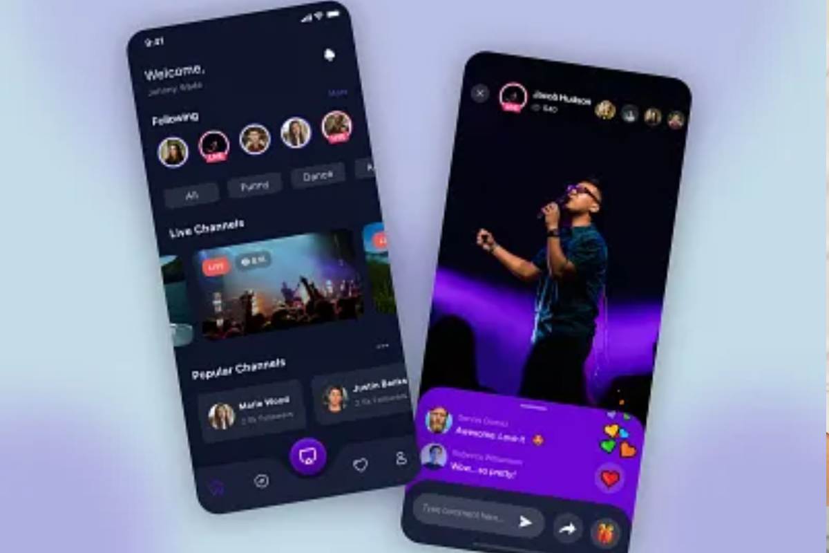
A streaming app’s real elegance lies in efficiency. Every gesture should have a purpose, every pixel a role. Clean grid layouts and limited color palettes keep attention on content instead of chrome. Buttons need consistent placement, and icons should rely on recognizable shapes rather than trendy outlines that fade fast.
When developers refine details like tap response or playback recovery, they shape how viewers perceive trust. A quick load tells the brain that this is safe space. For many, the first gateway to that experience begins with the desi play app, where lightweight architecture meets visually grounded design. It mirrors the kind of balance discussed on thebeautyweb.com – a place where structure enhances allure, and subtlety becomes the luxury. In software, that means fewer distractions, more time spent on what matters: uninterrupted viewing.
The Anatomy of a Calm Interface
Visual calm does not come from empty space alone – it comes from rhythm. A stable baseline grid guides motion, text, and image alignment, keeping the interface coherent across devices. Margins breathe; transitions glide. Typography does the heavy lifting: clear sans-serifs for headlines, softer rounded fonts for captions, all tuned for legibility at arm’s length.
Layout discipline goes beyond looks. Predictable structure reduces cognitive load, letting users anticipate where playback controls or menus will appear. Once behavior becomes instinct, the app stops demanding attention and starts giving it back.
Simple Design Habits That Build Calm
- Keep main controls within the natural thumb arc.
- Avoid full-screen ads or auto-playing previews.
- Maintain consistent color temperatures for day and night themes.
- Use micro-animations sparingly to signal state changes.
- Offer quick brightness and volume sliders within the player view.
These habits form an invisible language of care, proving that restraint often delivers the richest experience.
Crafting for Mid-Range Reality
In desi households, devices span generations. A good app must work gracefully on the newest flagship and the three-year-old phone with limited RAM. Lightweight codecs, compressed assets, and deferred loading turn inclusivity into performance. Prioritizing “first frame” time over visual flourish ensures that everyone, regardless of connection strength, starts watching in seconds.
Battery and data optimization further strengthen loyalty. When users notice that an app preserves charge or reduces data drain, appreciation becomes attachment. It’s performance meeting empathy – two halves of the same aesthetic.
Emotional UX – The Beauty of Predictability
The emotional layer of design often hides in micro-interactions. Buttons that react softly, progress bars that move smoothly, and haptics that feel deliberate all tell the user: “You’re in control.” Predictability feels luxurious because it removes anxiety. Each tap should confirm success instantly, not leave the user guessing.
Consistency across landscape and portrait modes keeps visual logic intact. Fonts resize proportionally, menus slide rather than pop. The experience becomes seamless, like a daily skincare routine – steady, reliable, and satisfying. That same sense of flow is what design-focused communities celebrate: a product that takes care of itself while taking care of the user.
Beyond Looks – Trust as the Core Feature
Visual polish can attract a first install, but retention comes from trust. Transparency in permissions, straightforward privacy language, and stable performance through updates communicate integrity. A viewer who knows that an app won’t eat bandwidth or crash during a finale will recommend it naturally.
Update cadence should mirror user rhythm. Frequent micro-fixes prevent fatigue better than massive overhauls that force re-learning. Changelogs written in simple English build transparency and reinforce brand maturity.
Where Aesthetics Meet Utility
At its best, design is invisible. A well-built desi streaming platform doesn’t compete for attention; it earns it through smooth delivery and emotional steadiness. Each part – from loading screen to pause icon – contributes to a sense of order that keeps viewers anchored. In a world where every app shouts louder, quiet competence stands out.
The path forward for streaming in diverse markets is clear: beauty through balance, reliability through restraint. When architecture supports emotion and performance honors patience, digital experiences start to feel almost human. That’s the quiet victory of a design culture where every pixel works, every gesture lands cleanly, and users end the day feeling lighter than when they began.